Thesis
The direct comparison of the genes upregulated in various stem cell populations in the studies of Ivanova et al, Ramalho-Santos et al and Fortunel et al identified only a single common gene upregulated in all stem cell populations. Various conclusions were drawn about the reasons that caused such a small overlap between the gene lists. We hypothesize that they key core stemness group can only be identified if we move away from single gene overlaps and look for usage similarity at the level of functionally linked or evolutionarily linked groups of genes, such as paralog groups.
We want to test at the global level several hypotheses and answer the following questions:
a) Hypothesize that all stem cells use homology as a common mechanism to bridge between gene difference usage in different stem cells.
b) If this is not a mechanism that is applicable to all stem cells, is it valid within adult "tissue-specific" stem cells only?
c) Do more distinct adult stem cells use a larger variety of homolog group members than more homogeneous stem cell types (comparison between HSC and NSCs)?
d) Are any homology mechanisms transferrable to human stem cell experiments?
e) Are there commonalities in gene usage between the stem cell niches used by the different stem cells?
a) and b) are tested in two different stages: only within the 3 initial studies, or at the more global across-all gene expression experiments data
CURRENT PAPER FIGURES (as of Feb.7)
Figure 1: Intuition of stemness homolog group screen
Figure 2: Overview of the homolog group screen in three core stemness studies
Figure 3: Significant homolog groups in the three core studies
Figure 4: Gene usage patterns within significant homolog groups
Figure 5: Homolog group significance after data expansion
Paper Outline Figures (also related figures and tables)
Figure 1: Flow of method - homologs, expression data, stem cells
Figure2: Homolog differential expression weighted scores
We discussed the inclusion of entropy as a score, instead of my current sum-of-squares score. The following few extra figures are included to address a comparison between the two types of scoring. Generally, very few groups score as significant when we use the entropic score. There is a size-related dependence. The most highly significant groups using the entropy score are singletons. With the exception of a single group, none of the 17 "stemness" groups are significant anymore and the groups that were identified as strongly significant using the sum-of-square scoring are not significant anymore.
Additional figure a: Distribution of the entropy scores for real and randomized homolog groups
Comments regarding figure a: No major difference between real and randomized entropy scores (quantify!).
Comments regarding figure b: Very few significant groups using the entropy score! The most highly significant groups using the sum-of-squares method are not significant any more (see right tail of the plot).
Additional figure c: Significance of the homolog group score as a function of group size
Comments regarding figure c: Most groups found to be significant by the entropy scoring are singleton groups.
I do not think we should use entropy scoring for identifying stemness groups. The sum-of-squares method is still a good middle ground between using an "average" scoring or a "max" scoring.
Simulation
Simulation setup
Goal of the simulation is to select an appropriate scoring method for discovery of stemness homolog groups.
In order to identify an appropriate scoring method for discovering stemness homolog groups and due to the lack of good positive controls, I generated synthetic data for theoretical stemness and non-stemness groups. The total number of stemness groups in the synthetic data was selected to be 60 and the total number of non-stemness groups was 940. The number of experiments was chosen to be the same as my real data - 9 experimental populations. The size of each group was randomly sampled from an exponential with a mean of 4 genes. The data for the stemness groups was sampled slightly differently to reflect the nature of the groups I was trying to capture (multinomial with different probabilities for genes in the group, based on the nature of the group):
a) one-gene - all-tissues stemness groups (a multinomial with one heavily weighted gene; one draw per experiment)
b) one-gene - one-tissue stemness groups (a multinomial with all genes equally likely; one draw per experiment)
c) complex groups (a multinomial with all genes equally likely; two draws per experiment)
Noise was also added to the simulated data at a different FP/FN rate based on a parameter choice (0,5,10, or 20 percent). In particular, if a FP rate of 5% was chosen, a non-upregulated gene in a non-stemness group was chosen to be called "upregulated" in an experiment in 5% of cases. Similarly, at a FN rate of 5%, an upregulated gene in a stemness group was called "non-upregulated" in an experiment in approx. 5% of cases.
Here is a summary of all parameters in the performed simulations:
1.) FP/FN rate = 0%, 5%, 10%, 20%
2.) Exponent in group score (the current score is quadratic) = 1/2 (Square root), 1(Linear), 2(Quadratic), 3(Cubic), current score
3.) Weight of individual experimental scores = -log(fraction of all upregulated genes in exp.), 1/fraction of all upregulated genes in exp., (1-fraction of all upregulated genes in exp.)
All-vs-all comparisons were performed and results are shown below in the form of precision/recall plot figures.
Simulation results
Based on the specific parameter choices, scores were calculated for all groups. 1000 randomizations were performed on each set of simulated data, distributions built and a p-value assessed for every group (a normal was fitted to every distribution). A p-value cutoff was chosen for TP/FN,TN/FP selection at progressively more stringent p-value cutoffs (p=0.05; 0.01; 0.001; 0.0001). Plots d and e show results at a p-value cutoff of p=0.05.
Additional figure d: Precision-recall plots for various exponent forms
Additional figure e: Precision-recall plots for various FP/FN forms
As expected the precision-recall dropped with the increase of noise (FP/FN rates) in the simulated data. Lower exponent forms consistently performed worse and showed a lower precision-recall rate than higher exponent forms. In particular, the cubic scoring method consistently performed the best, as measured by the significance of groups. The current scoring performs fairly well and on par with the quadratic scorings that rely on different experiment weightings. Finally, the various experiment weightings (see #3 in the Simulation Setup section) tested in this simulation did not show any difference between each other in terms of precision-recall rates.
Additional figure f: Precision-recall plots for various significance cutoffs
Additional figure f shows the precision-recall values for every simulation parameter choice, based on FP/FN rate of 5% at different significance cutoffs. The results indicate that there is a tradeoff in the selection of the cutoff at p=0.05 (gain in recall) and p=0.01 (gain in precision), but no significant drop in recall unlike more strict p-value cutoffs.
The table shown below has all results (TP/TN/FP/FN and precision/recall values) summarized for all parameter choices:
Additional table: Summary of simulation results
I also compared the sensitivities of simulated stem cell groups for the different patterns expected to see - one-gene-all-tissues, one-gene-one-tissues, complex
Figure 3: Heatmap of homolog differential expression
Figure4a: Four theoretical expression pattern types among homolog groups
I have incorporated all homolog groups with their current pattern assignment into the following document (note that they are ordered in decreasing order of significance; for groups with ties, the order is determined simply by the numerical value of the group name):
Figure/Table 4c: Visual representation of all homolog groups and their pattern assignments
Figure5a: Generality of significance results after addtional data source inclusion
Figure 5b: Boxplots for significance of individual group scores as a function of the random expansion of the data sources used (in process; waiting on programs: for every 10th percentage point, random selection of the appropriate number of data sources, calculation of scores and random permutation of the scores to calculate significance)
Figure 5c: Matrix which shows which groups have remained significant after randomly expanding the data sources used (in process)


Outline
1. Get lists of genes from the 3 papers.
Issues: This is only one way of getting the upregulated genes. A different method would be just to run differential expression analysis on the data and get a list of differentially upregulated and differentially downregulated genes and use those as a starting point instead (Run SAM for example). This also raises the issue that we are currently only looking at genes that are upregulated, but there is going to be some important genes that may get downregulated and then turned on in later differentiation stages.
Figures: Show the transformation of all tested genes into the groups of upregulated and downregulated groups and how those change when distributed between homolog groups and pathways. Pie charts may be appropriate here.
2. Repeat the gene-to-gene analysis and intersect.
Issues: Do we really want to do a direct intersection? Another possibility is to collapse the data based on the tissue into different tissue types and then combine the partial scores. This would be considered a "soft" intersection, because each tissue type can contribute with the partial score, even though the gene may not be expressed in each and every experimental population.
Figures: Venn diagram showing the overlap between the genes in each experiment - only a single gene
3. Expand the intersection analysis using sequence or functional homologs. How are we going to get those?
a. High-scoring sequence homologs - I've already done that with the homolog groups analysis
b. Potential functional or structural homologs - ligand binding? pfam similarities, pathway similarities, process or biological funtion GO categories
c. Look at pathway activation - are there common themes among the activated pathways? What does it take to activate a pathway? A single gene or a significant upregulation?
Is there a significant similarity and selectivity for stem cells vs. non-stem cells at any level
4. Repeat analysis for downregulated genes in stem cells
5. Expand analysis to newer datasets
6. Search for conservation of paralogs or mechanisms related to the function of known stem cell regulators (Bmi1, Hoxb4,Notch, Sox7, Sox10)
Decisions to make:
1. how to form paralog groups? Do we have a good way of forming such groups? If not, what else should we try?
2. how to form the "common" paralog groups and still allow for error
3. how to deal with redundant data (3 ESC arrays vs. 1 RPC array)
Introduction and background
Results
Datasets
We are working with data lists from 3 different experiments in mouse stem cells
1) Ivanova (HSC, NSC,ESC cells)
2) Ramalho-Santos (HSC, NSC, ESC cells)
3) Fortunel (RPC, NPC, ESC cells).
We are working with the lists of genes that are upregulated in each type of stem cell population - in total 9 populations.
Methodology
Homolog groups
Need to explain about performing blast.
Initial paralog groups were obtained by performing BDS from a single genes and forming a group starting at each unexplored gene. The search yielded 14,941 gene groups (most of them singletons; cutoff: 1e-70). In order to reduce the number of singletons, we performed neighbor expansion, such that each singleton was placed in the same group as its highest scoring alignment neighbor (p-value cutoff = 1e-10). If no such neighbor existed at the chosen cutoff, the singleton remained in its original paralog group by itself. See figure for details:
After the neighbor expansion and restriction of the genes to only the ones tested in the 3 data sources, the total number of genes is reduced to 6,843 genes distributed between 4,001 mututally exclusive homolog families. Figure 1a shows the distribution of group sizes (which remains the similar to before):
We then transformed each list of upregulated genes in a stem cell population into a set of upregulated paralog groups in the same stem cell population. See figures 2a and 2b for details. Table1a also provides an annotated list of the groups and genes represented in the groups that are found in the intersection of all lists of upregulated paralog groups in the available datasets:
Figure 2a: Transformation of genes into paralog groups per dataset
Figure 2b: Intersections of paralog groups per dataset and between datasets
Table 1b shows only the annotated genes (and the clusters they belong to) that are actually found to be upregulated in one or more of the 9 lists of interest. The actual number of genes is approx. 237 (reduced from ~1100 genes total in the upregulated paralog groups).
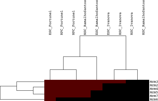
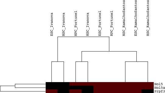
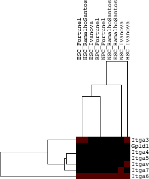
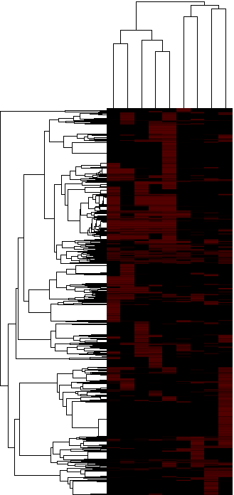
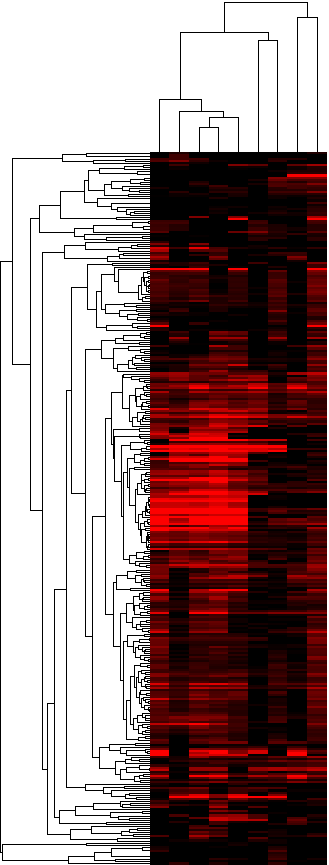
As a next step, we evaluated the significance of overlap between each paralog group (we tested all 10,215 paralog groups) and the lists of upregulated genes in each of the 3 starting datasets, i.e. we assess if a significant number of members of a paralog group were upregulated in each of the 9 lists of upregulated genes. We classified the paralog groups based on how many datasets they were identified to be significant in, as well as by the combined significance as assessed from the 9 tests performed for each paralog group. Table 2 provides a table of results, ranked by the number of lists in which the paralog group was significant (p-value cutoff: 0.05) and then by the combined p-value. Figures 3a and 3b provide two different looks in a heatmap format of the same data (3a is hierarchically clustered by both list and paralog group; average linkage; uncentered correlation metric, while 3b is ordered in the same way as Table 2).
Table 2: Annotated_list of the top_significant_paralog group
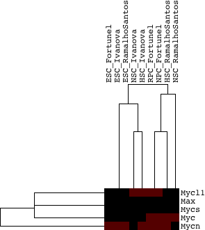
The only group found to be common between the groups in the 3-way intersection (paralog groups found in all upregulated lists) and the top significant paralog groups among all upregulated lists is Cluster 8: Zinc finger proteins.
Note that for both heatmap figures the data has been transformed to: log10(0.1/p-value), such that the most signficant p-values are shown now in bright red and the least significant p-values are displayed in bright green.
Figure 3a: Heatmap of the significances of annotated clustered paralog groups - Java Tree View files: CDT GTR ATR
Figure 3b: Heatmap of the significances of annotated paralog groups ordered by significance - Java Tree View files:TAB JTV
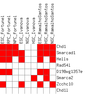
I have also included a table that is gene-centered and shows all genes with their corresponding paralog groups, as well as a present/absent value in all differential expression lists. The second part of the table (Sheet 2) looks at a filtered version of only the genes that are differentially expressed in at least one list.
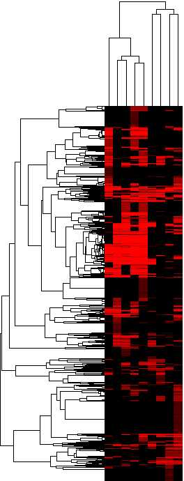
Figure 3c: Heatmap of the upregulation scores at the homolog group level (average score) - Java Tree View files: CDT GTR ATR
Figure 3d: Heatmap of the upregulation score at the homolog group level (gene-boosted score) - Java Tree View files: CDT GTR ATR
The actual heatmaps are shown below. The one on the left is Figure 3c (average scores used) and the one on the right is Figure 3d (gene-boosted scores used):


To assess the significance of the 17 paralog groups in the intersection, randomization was performed (as described in figure 4a). A distribution was obtained for every paralog group size (example one is given in figure 4b).
The following results were obtained:
We wanted to also find out if the number of stemness paralog groups was significant in its self. For these purposes we used the randomized data (as described in figure 4a) to assess what paralog group were upregulated in each population and assessed the number of randomized common stemness homolog groups for each of the 1000 randomizations. We discovered that the number of stemness homolog groups was not significant.
Figure 5: Significance of the number of stemness homolog groups in the three studies
We also compared within each stemness homolog group, the domains or the transcription factor binding sites in each of the genes in the group that were expressed vs the ones that were not expressed. We were looking for differences that may show why some genes in the group were being used and upregulated vs. others. Specifically, we look for common PFAM domains among the upregulated genes that may be missing in the nonupregulated genes in the group. Similarly, we also look for non-redundant transcription factor binding sites that were enriched in at least 25% of either the upregulated genes but not nonupregulated or vice versa. The results are shown below:
Scoring schemes of homolog groups
I currently have 3 different methods of estimating scores for homolog groups:
1. an all-around score, where each upregulated set is treated independently (9 different sets of upregulated genes)
2. a consensus tissue score, where all experiments are reduced to the tissues that they test and a gene must be upregulated in 2/3 of the experiments on the tissue in order to be called upregulated in that tissue)
3. a progressive tissue score, where all experiments are reduced to the tissues, but the tissue scores can be fractional and all data points are included and tested for significance.
In order to compare them next to each other, the table below provides the group scores and associated empirical p-values calculated for each type of scoring along with annotation for each group. Some of the common homolog groups still score as significant in all scoring schemes (such as the zinc finger family, along with the Myc, integrin alpha):
Table: Comparison (scores and p-values) of all three scoring schemes for all homolog groups
The next few figures show direct comparisons of p-values associated with each scoring scheme to get an understanding of how these different schemes track with each other on a global level. These results indicate (as expected) higher similarity between the all-around scoring scheme and the progressive tissue scoring scheme. There is generally a fairly good agreement for important groups (with significant p-values - lower left corner). These results are also shown in log-log format (figure 7b), where important and highly significant pvalues are in the top right-hand corner (higher positive values). The blue striped lines show the significance cutoff of 0.05 in each direction.
I have also compared the scoring methods as as a function of the p-value significance. The next few figures show the results for that. Note that Figures 7d and 7e are different representations of the same data, but they differ from 7f in that 7d-e show only data for p-values more significant than 0.05 (in fact, more stringent than that, approx. 0.031, since I chose the -log10(pvalue) to be 1.5), while 7f shows the data for all p-values.
Figure 7f: Comparison of scoring methods as a function of the p-value results - no cutoff
The above results indicate preference for stronger p-values by the all-around scoring methods, followed closely by the consensus method of scoring.
I have also compared the scoring methods as a function of the size of the homolog group and the results for this are shown below in figure 7g. Results indicate that across all homolog group sizes, the highest significance is predominantly observed from the all-around scoring scheme.
Figure 7g: Significance of different sizes of homolog groups by the three different scoring schemes
Another way to compare these scoring schemes is by rank-transformation. For each scoring schemes I transform the p-values into ranks by ordering the groups from most significant to least significant. After that I compare each pair of scoring schemes to see if any of them show significant differences between each other. The purpose of this rank test is to see if only the strength of the scores is different between the scoring schemes, but perhaps these schemes do not have significant differences in how they order the groups. Results can be seen in Figure 7h-i. Figure 7h shows results across all 4001 groups. The signed rank p-values indicate that does not provide a significantly different ranking from the consensus tissue ranking, while it does have barely significant differences with the fractional tissue ranking. On the other hand, the consensus and fractional tissue rankings show a marked difference between the way they rank groups. Figure 7i restricts itself only to looking at the 250 ranked groups in a scoring scheme.
Figure 7h: Comparison of the rankings of homolog groups by the three different scoring schemes
Figure 7i: Comparison of the top 250 ranked groups in the different scoring schemes
GO analysis for selection of best method
The purpose of all of the above figures (7a-7i) has been to identify the scoring scheme, which is most appropriate for our subsequent analysis. Another way to attempt to address this problem has been to pool together all genes that are identified as significant by one method, but not the other and look for GO enrichment. Specifically, that means looking at the enrichment in 6 different sets:
i) Groups that are significant by all-around scoring but not fractional scoring.
ii) Groups that are significant by fractional scoring but not all-around scoring.
iii) Groups that are significant by all-around scoring but not consensus scoring.
iv) Groups that are significant by consensus scoring but not all-around scoring.
v) Groups that are significant by consensus scoring but not fractional scoring.
vi) Groups that significant by fractional scoring but not consensus scoring.
The groups are in each set are pooled together and are run against all available GO categories in mouse (a total of 6,434 groups). The tables below provide the functional enrichment of the groups (with and without the correction for multiple testing; after the correction some of the sets do not have any significant categories and a lot of the differentiation-specific categories do not make the significance cutoff. My immediate observation is that two of the sets capture information about Notch, extracellular matrix components and cell adhesion (Group i and Group v), that we shouldn't miss. These are groups that seem to be missed by fractional scoring. This leaves us with a choice between the all-around and consensus tissue scoring. There is no significant enrichment among the genes missed by all-around scoring, but captured by consensus scoring. If we broaden our view and look among all borderline enriched categories, the genes in set iii not only show some significant enrichment to signaling-related categories, but also to differentiation-related categories. Therefore, based on these results, I think we should be using the all-around scoring scheme. It should be noted in regards to Figure 7h that based on those results, all-around scoring and consensus scoring do not rank groups in a significantly different way (Wilcoxon signed rank p-value = 0.47), indicating that on a global level the results from these two scoring analyses should be similar. However, if we restrict ourselves to only the top250 ranked groups by all-around scoring and compare them with their corresponding ranks in the consensus scoring, they show significant difference (Wilcoxon signed rank p-value = 6.465e-07).
A different argument for using consensus scoring however is that it would facilitate tissue-specific analysis, although the tissue-specific analysis can be performed with either method.
Q-Value analysis
A q-value associated with every group can be thought of as the expected proportion of false positives that will be accumulated if that group is called significant. Using the QValue Bioconductor package in R, we can estimate these for every group and p-value for each method tested above (all-around, consensus tissue, and fractional tissue scoring). Each figure is subdivided into 4 sections. Section 2 (upper right) directly plots, the p-values vs. the q-values associated with that p-value. Section 3 (lower left) plots each q-value cutoff vs. the number of significant groups at that cutoff, while section 4 (lower right) plots the number of significant groups vs. the expected number of false positives for that many significant groups.
Figure 8a: Q-value plots for all homolog group results calculated using the all-around scoring
Figure 8b: Q-value plots for all homolog group results calculated using the consensus tissue scoring
Tissue-specific homolog groups
Similar kind of analysis was also performed at the specific stem cell type level. The 21 neural-specific and 31 embryonic-specific stem cell homolog groups are shown in two separate tables below, along with the annotations of the genes found in them:
Table 6a: Neural-specific stemness homolog groups
Table 6b: Embryonic-specific stemness homolog groups
Address figure 9a below. This is a different analysis altogether.
Figure 9a: Common upregulated groups at the NSC and ESC levels only
Pathways
Another way of forming groups is to directly use pathways, instead of forming homolog groups. It is a different look at the same data, but it provides somewhat orthogonal information. For this analysis I did not use GO, but only Biocarta and KEGG-defined pathways. I started with a set 354 pathways and for all further analyses, restricted them to only genes that were tested in the 3 studies. The pathways varied in size afterwards between 1 and 69 genes. [NEED to include a a figure with the distribution of pathway sizes]
I transformed the genes into pathways and it should be noted that now a single gene can be present in more than one pathway and if that did happen all pathways in which the gene occurred were kept. After this transformation, I looked for common pathways to all upregulated lists. Table 6 shows several important points - identifies each pathway, the combined p-value for the number of upregulated genes in each upregulated list, the number of lists against which the pathway was found with a significant number of upregulated genes; whether the pathway was common to all studies, and finally the size of the pathway. The combined p-value was identified by looking at the hypergeometric overlap between each pathway and each of the upregulated lists to find if a significant number of the genes in the pathway were upregulated in the given population. After the individual p-values were calculated, the combined p-value was calculated using the symmetric uniform.
Are there common themes between some of the pathways and the homolog groups we defined earlier:
--the thrombins keep coming up with some of the collagens in the "prothrombin activation" and "thrombin signaling" pathways
--map kinase signaling pathway has a lot of the map kinase family members that came up in the homolog family analysis
--the protein kinase C family in the homolog analysis comes up within the "phosphatidylinositol signaling" system pathway
The next step is to assess the significance of all common groups - the randomization is now a little complicated by the fact that a gene can occur in more than a single pathway. Upload results as soon as the randomization is completed.
Below is a heatmap view of the pathway scores per experiment. They have been calculated again in two different ways. The first method is to simply take the average of the binary score, associated with each gene, or alternatively the contribution of the gene to the pathway score per experiment is dependent on the number of experiments the gene is upregulated in.
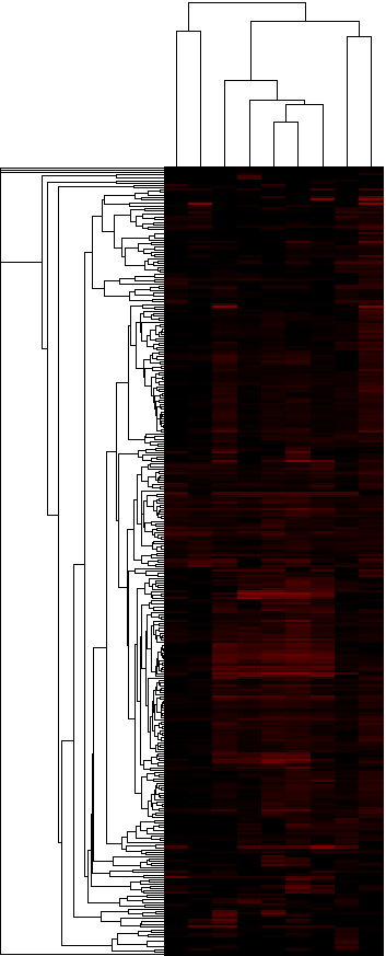
Figure 10a: Heatmap of the upregulation scores at the pathway level (average score) - Java Tree View files: CDTGTR ATR
Figure 10b: Heatmap of the upregulation score at the pathway level (gene-boosted score) - Java Tree View files: CDTGTR ATR
I have attached the files from Java Tree View, so that the results can be viewed in the tree viewer directly. The actual heatmaps are shown below. The one on the left is Figure 10a (average scores used) and the one on the right is Figure 10b (gene-boosted scores used):


Scoring schemes for pathways
I compared the three scoring schemes discussed earlier under the homolog group section (all-around, consensus, fractional) in the pathway level of analysis. I re-selected my pathway set (Biocarta + KEGG + GO Myers), such that it is restricted to only the genes in the pathways that have been tested in the experiment. After that selection any pathway that had more than 5 members was left in the set and the set was further filtered for redundancy. The redundancy filtering was performed as follows: order the pathways by size starting with the larger pathways, then remove any subsequent pathways that have more than 2/3 overlap with any of the pathways already selected. After this filtering, the final set of 293 pathways was evaluated with the three scoring schemes and results were compared for these different scorings. Below in figure 11 (11a-11b), we can see two different views of the results. Figure 11a shows a log-log plot of the -log10 pvalues obtained for each pathway based on random simulations for each scoring scheme. Figure 11b shows a comparison of the ranks obtained for each pathway based on the most to least significant p-values obtained for each scoring scheme. The figure also shows results from performing the Wilcoxon rank test to evaluate the difference between the scorings. Both figures indicate no significant difference between the different scoring schemes on the pathway level and a strong correlation between the results from each scoring type. Because of that I think the pathway analysis is unreliable for the selection of a scoring scheme for the paper. The all-around scoring, however, shows stronger p-values, which will be shown in a figure 11c. (upload 11c when the figure is ready).
Figure 11b: Comparison of the rankings of the pathways for all three scoring schemes
The following table also has the p-value results associated with each scoring scheme for each one of the pathways that passed the initial criteria:
Table 9: Comparison of p-values for all tested pathways using all three scoring schemes
Positive control pathways
I also have a set of positive controls which I have hand-selected from the pathways before testing. Are they appropriate? I am a more confident in the selection of 1,4, 6,7, but one of the problems is that some of these pathways will contain elements that are expected to be turned on, and others that are expected to be downregulated in the process of differentiation, so are they appropriate for positive controls?
| Name of positive control pathway | Rank of pathway using all-around scoring | Rank of pathway using consensus tissue scoring | Rank of pathway using fractional tissue scoring |
| Integrin_Signaling_Pathway_pathway |
102 | 93 | 106 |
| WNT_Signaling_Pathway_pathway | 29 | 27 | 26 |
| TGF_beta_signaling_pathway_pathway | 81 | 96 | 64 |
| Telomeres_Telomerase_Cellular_Aging_and_Immortality_pathway | 22 | 26 | 21 |
| Cell_to_Cell_Adhesion_Signaling_pathway | 221 | 151 | 190 |
| Cell fate commitment | 41 | 82 | 38 |
| Regulation of cell differentiation | 60 | 89 | 80 |
There is no statistically significant difference between the rank results of all positive control pathways for every pair of scoring schemes (using Wilcoxon to perform the comparison). Also, note that these ranks are out of 293 pathways total.
Q-plots for pathways and all methods
A q-value associated with every pathway can be thought of as the expected proportion of false positives that will be accumulated if that pathway is called significant. We can estimate these for every pathway and p-value for each method tested above (all-around, consensus tissue, and fractional tissue scoring). Each figure is subdivided into 4 sections. Section 2 (upper right) directly plots, the p-values vs. the q-values associated with that p-value. Section 3 (lower left) plots each q-value cutoff vs. the number of significant pathways at that cutoff, while section 4 (lower right) plots the number of significant pathways vs. the expected number of false positives for that many significant pathways.
Figure 12a: Q-plot for pathway results calculated using the all-around scoring method
Figure 12b: Q-plot for pathway results calculated using the consensus tissue scoring method
Figure 12c: Q-plot for pathway results calculated using the fractional tissue scoring method
Gene Usage
One question to be addressed is if more distinct stem cells use a larger variety of homolog group members than more homogeneous stem cell types. For example, NSCs have been described in a variety of studies to have large variability, while HSCs are thought to be more homogeneous. The following few figures examine this question at a global ("all homolog group" level). In particular, for each homolog group and stem cell type, we identify the gene in the group with the highest usage (for example, if there are three experiments and there is a gene in this group which is upregulated in all of them, the score for the group is 1 --- it is the max of the averages across all genes in the group).
My expectation is that if homogeneous stem cell types tend to use a single gene more and non-homogeneous stem cell types use a larger variety of homolog group members, then the differences between the max gene usage in the homogeneous set and the non-homogeneous set will be skewed towards the homogeneous set, as the max gene usage score will be higher. That shows NOT to be the case when we compare HSC and NSC populations, as well as HSC and ESC populations. Based on these results, homogeneous stem cells do NOT globally use a single gene among homolog group members more than non-homogeneous stem cells. The difference between gene usage in HSCs and NSCs globally across all homolog groups is significant in favor of higher single gene usage score in NSCs (opposite of expected), based on a paired t-test between all homolog group gene usage scores (t-statistic:-2.96, p-value: 0.001785)
Larger number of data sources
Figure 14: Top25 most significant homolog groups based on larger number of data sources
Table: Significance of homolog groups based on large number of gene expression studies in mouse
-
- Set DENYTOPICVIEW = TWikiGuest?
-- Main.Martina - 31 Jul 2008